Monday
Oct312011

Helping walkers find their way

We created a series of visually appealing maps for the use of customers at the French Horn Hotel in Sonning. Careful editing and clear colour coding make the maps simple and easy to use. We made a series of wayfinding 'tulips' to indicate walking direction.

David Woodward, who set up Design for Print, first produced work for the renowned hotel and restaurant when he was just 11.

Friday
Dec182009

Selected to bid for ‘Our Sporting Life’

Design for Print was asked to contribute to a bid for the design of over 200 exhibitions to be staged at sports venues and local museums across the country. Working with Museophile Limited and Will Bowen, the leading theatre designer responsible for work on 'Phantom of the Opera', we designed an innovative system for the local production of exhibitions which included the display of people's own sporting stories on hanging cut-out panels.

Friday
Oct092009

Going green with Bottomline

Design for Print recently created a successful campaign to persuade staff at Bottomline Technologies EMEA HQ to 'think before they print'.

We wrote the copy, researched and sourced suitable images, and designed a range of posters and stickers. They were produced and delivered them in time for a visit by the CEO, just two weeks after we were briefed.

Friday
Aug212009

Online portfolio now available

We recently posted a new online portfolio in PDF form. It shows a range of recent work, including logos, brochures and book design.

Tuesday
Aug042009

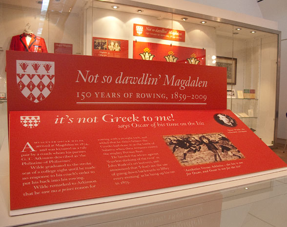
Not so dawdlin at the River & Rowing Museum

Design for Print recently completed in record time some new exhibition panels for the River & Rowing Museum in Henley-on-Thames. They tell the story of two very different boat clubs. Seven panels commemorate 150 years of rowing at Magdalen College, Oxford and and a further set describe the rise and fall of the Shanghai Boat Club.

For Magdalen we selected the elegant typeface Janson Text with its non-ranging numerals and small capitals. Oscar Wilde's career as an oarsman was brief, since he followed advice to avoid 'fruitless slashing of the river'.

To tell the Shanghai story we chose a typeface called 'Sho' - which looks convincingly oriental rather than being a clumsy pastiche.